My Personal Experience
When preorders for the iPhone 6 opened last Friday morning, I began attempting to access the Apple Store immediately both through my desktop browser and the iOS Apple Store app. The online store had been offline for several hours before as Apple prepared the portal for preorders. After an hour of constant refreshing on my PC and iPhone, the store remained unavailable. After nearly two hours, I was able to select an iPhone on the Apple Store app. But when I reached the final step, the phone would be unavailable, regardless of the model selected. After giving up and preparing to go to sleep at around 2:30 AM, I decided to try one last time. I was finally able to put in an order for the iPhone 6 Plus, with availability on launch day (September 19).
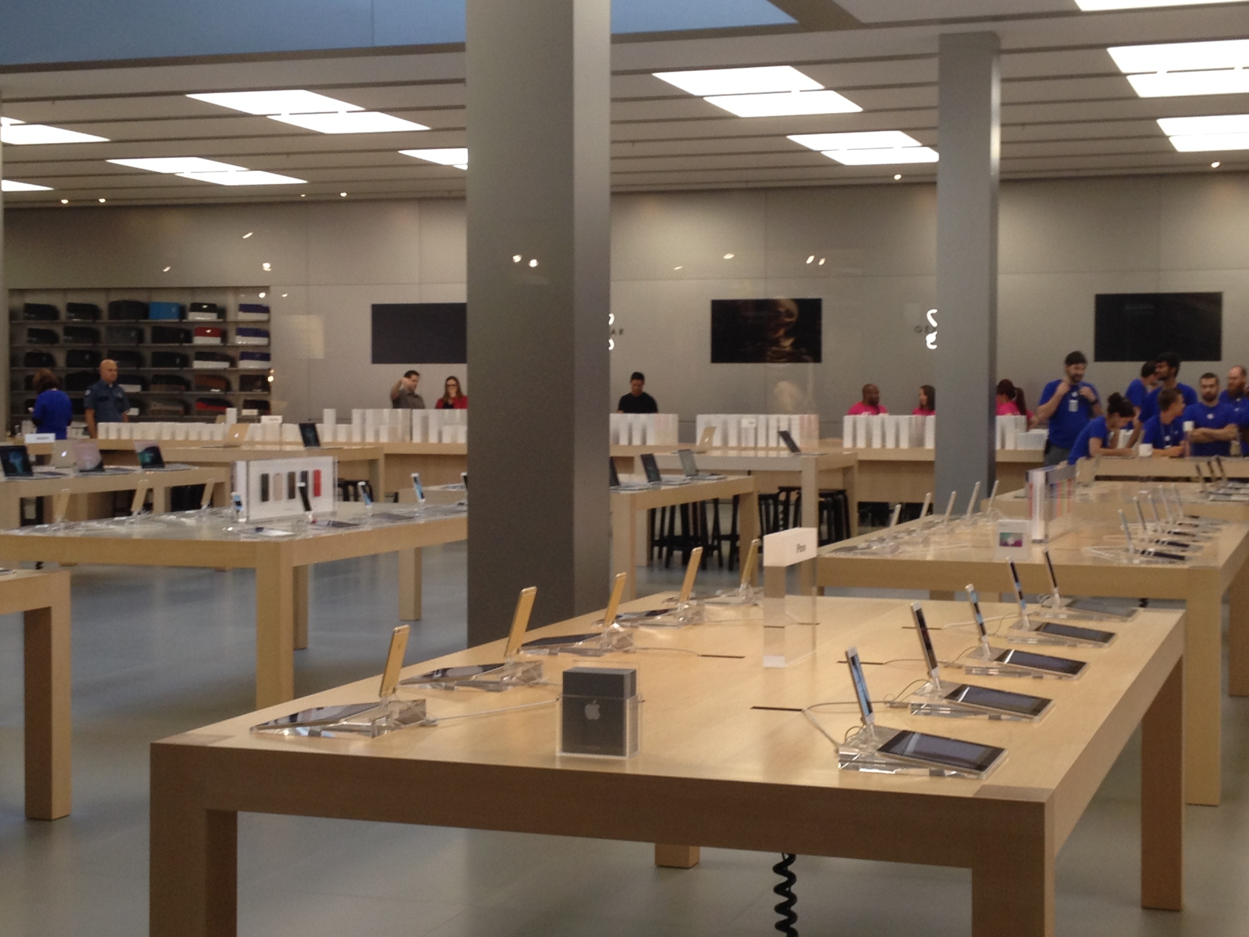
Being one of the largest Apple Stores in the Pacific Northwest (if not the largest), the Bellevue Store location was well-stocked with iPhone 6s for walk-in customers. Even with hundreds in line, those at the end were reassured by employees that they would get an iPhone.
Having selected in-store pickup, I arrived at Bellevue Square around 6:00 AM. The mall, which also has Verizon Wireless, T-Mobile, and AT&T stores, had a small line of Verizon customers at one entrance. By the time I arrived, the line for the Apple Store numbered perhaps a thousand people. Online reports from other iPhone buyers noted that by midnight, there were already well over two hundred people at Bellevue Square.
Once customers were moved indoors, preorder pickups and walk-ins were separated into two lines, with around thirty people with preorders. I was able to enter almost immediately when the doors opened at 8:00 AM. After receiving my phone, the store employee ran into a snafu attempting to activate it. Consulting with an AT&T representative onsite revealed that the unlimited data plan for iPhone 4S needed to be changed to data for 4G LTE manually. The process required chatting with an AT&T technician over the Internet. After nearly an hour, I was able to finish the purchasing process.
As with all other iPhones in Apple's current lineup, the 6 Plus ships with a set of EarPods with Remote and Mic in travel case, AC adapter, and Lightning to USB cable.
Packaging is similar to previous iPhones, but the lid noticeably omits imagery in favour of an embossed silhouette of the device within. The colour of the phone (same silver, gold, and space gray options as the 5S) is only noted in small type on the back of the box.
Hardware
iPhone 6 Plus next to common household objects. Despite the leap in screen size, it's still usable one-handed.
With a 5.5" display, the iPhone 6 Plus fits into phablet territory, competing with phones such as the LG G3 (5.5") and Samsung Galaxy Note 4 (5.7"). However, the 6 Plus's 1920x1080 401ppi display has a lower resolution and pixel density than LG and Samsung's latest offerings. Under most conditions, users will not notice a difference. In comparison to the standard iPhone 6, which retains the same 326ppi pixel density as the iPhone 4 and 5, some reviewers have noted that text looks noticeably sharper on the 6 Plus side-by-side.
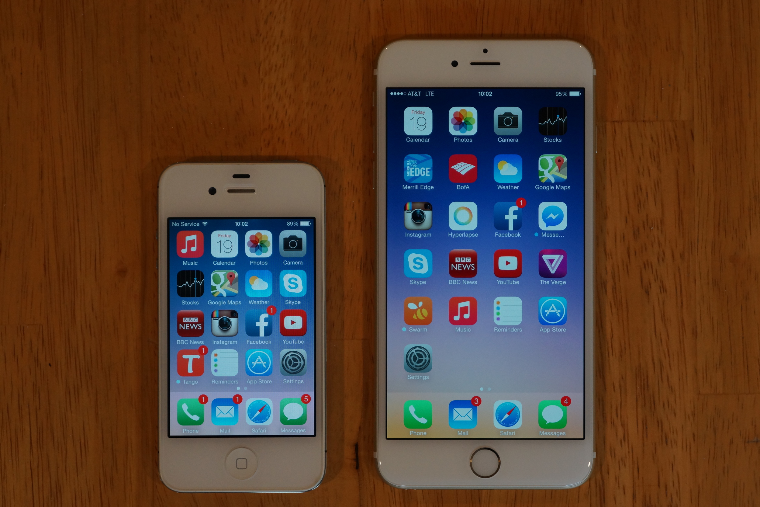
7.1mm thick iPhone 6 Plus next to 9.3mm iPhone 4S. Both new iPhone 6s are thinner than their predecessors. You can see the left side of the 6 sits slightly higher due to the protruding camera lens.
I was never a fan of the iPhone 5's exterior. Despite being a larger phone than the one it replaced, it was lighter and did not possess the same heft. The chrome beveled edges also scratched easily, giving it a cheap and weathered look. With the iPhone 6, Apple has returned to a denser device that feels rather heavy for its thin profile. The anodized aluminium case wraps around the edges and melds seamlessly with the curved glass display.
iPhone 6 Plus alongside a 4S. Both the 6 and 6 Plus add an additional row of icons to the 5/5S's five. iPhone 4 = 4 rows, iPhone 5 = 5 rows, iPhone 6 = 6 rows, iPhone 7 = 7 rows?
Many iPhone users have criticized the large size of the iPhone 6 Plus, believing it to be unusable. In the hand, I am able to firmly grip the phone on its sides (for reference, my hand measures 7 inches from the tip of my middle finger to the bottom of my palm). With a single hand, I am able to reach two-thirds of the display with my thumb. I do recommend that buyers pick up some sort of case if they opt for the 6 Plus, as the curved edges and aluminium back can make the phone feel a bit slippery.
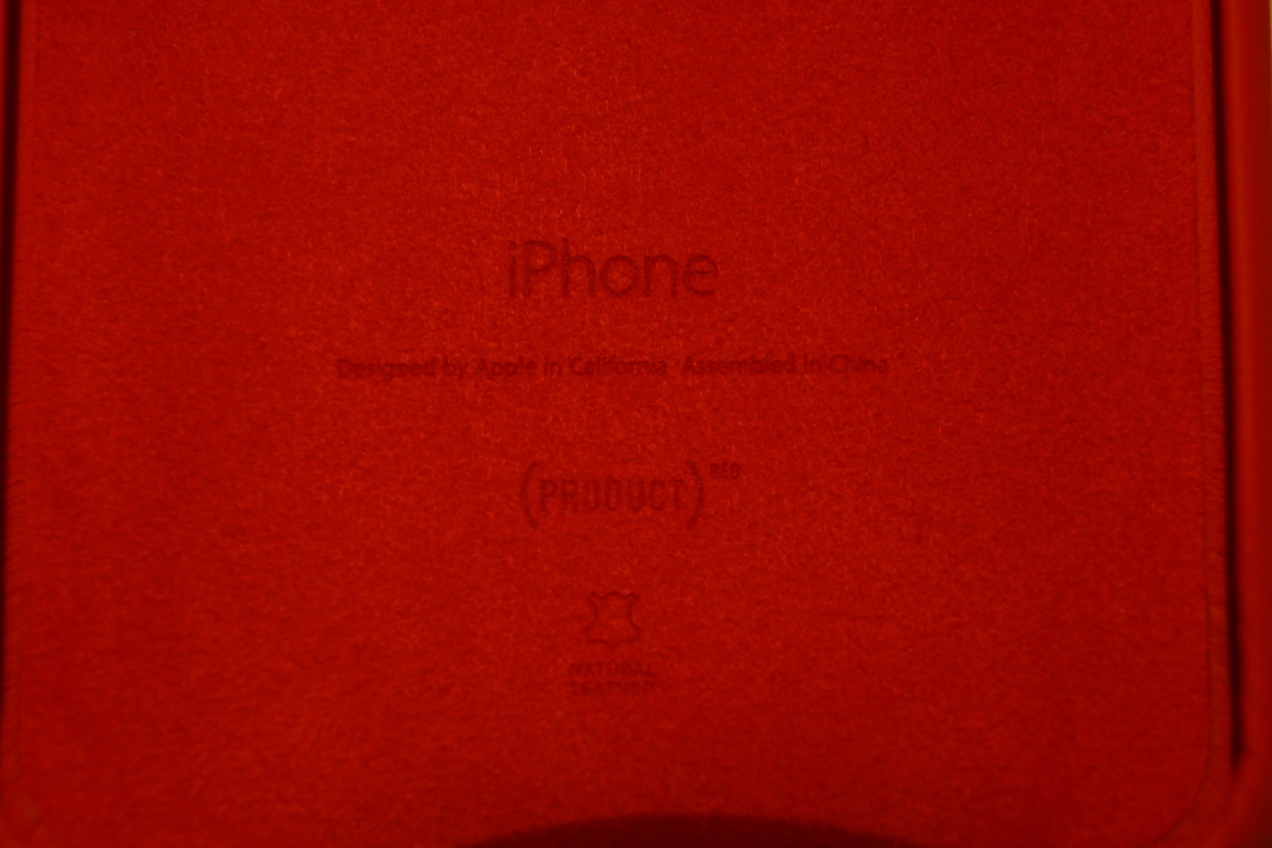
The Apple leather iPhone 6/6 Plus cases are made from genuine leather, and have a suede-like interior.
As the two Apple options (silicone and leather) were the only ones available in-store today, I picked up a Product(RED) case for my phone. Its matte texture improved grip significantly without adding too much mass. Unfortunately, the bottom left edge does not line up perfectly with the phone; hopefully this will change over time with enough use. Compared to the Apple leather case for iPhone 5/5S, the 6/6 Plus case has a much smoother look. I was told by the Apple Store employee that the silicone case has a texture similar to plastic.
Like the 5S, the iPhone 6 has an artificial sapphire camera lens, accompanied by an integrated two-tone LED flash.
Perhaps the worst part of the iPhone 6/6 Plus's design is the protruding camera lens. This is a first for an iPhone. Both the lens and bezel have the same depth. Users can take some comfort in knowing that the camera lens, like the TouchID home button, is made of sapphire crystal, which is virtually scratch-proof under 99% of circumstances. But without a case, the phone will rock from side to side when lying on a flat surface.
iOS 8
Apple calls iOS 8 the "biggest iOS release ever." However, many changes are under the hood, and not readily apparent when upgrading from iOS 7. Some things that one will notice immediately are that there is no longer a single folder for all your photos under the Albums tab in Photos, as it has been replaced by a Recently Added folder. The only way to access your entire camera roll is to select the Photos tab. This makes sense, as most users will not need to view older photos on a regular basis.
The Camera app adds a Time-Lapse and Slo-Mo video mode. On the iPhone 6 and 6 Plus, slow-motion video can be captured at a rate of 240fps, twice as much as on the 5S. There is also a self-timer option at the top.
iCloud backups are now saved to iCloud Drive. Free storage remains at 5 gigabytes.
By default, Safari now displays frequently visited sites on new tabs, just like its Mac OS counterpart.
New apps included with the operating system include Health, iBooks, Tips, and Podcasts. At the present time, these cannot be removed.
To aid the transition to a larger screen, iOS 8 on the iPhone 6 also introduces reachability, which lowers screen contents with a double tap of the home button. While not the most elegant solution, it should suffice, given that even with my small hands I am able to reach almost the entire bottom half the display with one hand. Users may also consider repositioning their most frequently used home screen apps to the sides of the screen for easier access.
Apps
At the present time, apps like Facebook simply appear as an enlarged and scale version of their 4" display counterparts.
Developers are gradually rolling out updates that guarantee compatibility with iOS 8 and the new iPhones 6s. However, it may be a while until apps are fully optimized for the larger, higher resolution displays. In particular, Facebook's buttons look abnormally large on the 6 Plus. Whether this is a permanent or temporary design remains to be seen.
Many bundled apps now appear "iPad-style" on the 6 Plus, taking full advantage of the increased screen real estate.
Of course, many of Apple's own apps come out of the box with iPad-inspired features. These include the Calendar, Stocks, Weather, and Reminder apps. Lists are displayed on the left, while the selected item is displayed on the right.
Initial Impressions
New features like profile pictures in Messages allow the iPhone 6 Plus to take full advantage of its larger, higher resolution display.
The iPhone 6 Plus is impressive by any measure. This phone is truly "bigger than bigger." Reading onscreen text is a relief for eyes when scaled. While my iPhone 4S could no longer get through an entire day of usage without a battery case (typically 1% per minute when using Internet), I can see myself using the 6 Plus for up to two days without charging (quoted battery life is 24 hours of talktime over 3G, and over two weeks of standby). Even in relatively tight jeans (but not skinny jeans), I am able to slip the phone into my front pocket. The bezel design however means that a tiny bit sticks out.
Future
Many customers have voiced their complaints regarding Apple's decision to continue using 1GB of RAM in the iPhone 6/6 Plus, despite many Android competitors moving to 2 or even 3 gigabytes. The longterm ramifications remain to be seen. But in the meantime, one must consider that iOS is tailormade for a very small family of devices (relative to Android), and runs very efficiently.
As Apple introduces a device that is part iPhone, part iPad, it's up to developers to devote efforts to take full advantage of the larger display and higher resolution the iPhone 6 Plus has to offer, and I anticipate many apps, especially those related to productivity, being updated to have dual-pane landscape views over the coming months.
As of this writing, Apple Pay has not been deployed, and has an expected rollout in October. While Android phones have been capable of Google Pay for some time now, there has been very little adoption among major retailers. The fact that Apple has worked very closely with credit card companies and vendors should push NFC and mobile payments. In particular, its perceived ease of use should attract many users.

